HTML部分:
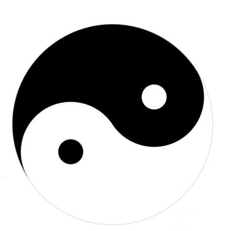
<divclass="square">
<divclass="rectrect_one">
<divclass="inner_circlerect_one_one">
<divclass="dotrect_one_two"></div>
</div>
</div>
<divclass="rectrect_two">
<divclass="inner_circlerect_two_one">
<divclass="dotrect_two_two"></div>
</div>
</div>
</div>
<divstyle="text-align:center;clear:both">
<scriptsrc="/gg_bd_ad_720x90.js"type="text/javascript"></script>
<scriptsrc="/follow.js"type="text/javascript"></script>
</div>
CSS部分:
<style>
.square{
width:400px;
height:400px;
position:relative;
transform:rotate(45deg);
-webkit-transform:rotate(45deg);
-moz-transform:rotate(45deg);
animation:rotateinfinitelinear5s;
margin:10%auto;
-webkit-animation:rotateinfinitelinear5s;
margin:10%auto;
-moz-animation:rotateinfinitelinear5s;
margin:10%auto;
}
.rect{
width:400px;
height:200px;
position:relative;
border:1px#d2d2d2solid;
border-bottom:none;
}
.inner_circle{
width:200px;
height:200px;
border-radius:200px;
position:absolute;
z-index:1;
}
.dot{
width:50px;
height:50px;
position:absolute;
left:0;
right:0;
top:0;
bottom:0;
margin:auto;
border-radius:50%;
}
.rect_one{
border-radius:200px200px00;
background:white;
}
.rect_one_one{
bottom:-100px;
left:0;
background:black;
}
.rect_one_two{
background:white;
}
.rect_two{
border-radius:00200px200px;
background:black;
}
.rect_two_one{
bottom:100px;
right:0;
background:white;
}
.rect_two_two{
background:black;
}
@keyframesrotate{
from{
transform:rotate(0deg);
-webkit-transform:rotate(0deg);
}
to{
transform:rotate(360deg);
-webkit-transform:rotate(360deg);
}
}
</style>
Tag:
如何
代码
